“This way for modern banking”: Deutsche Bank logo turns 50
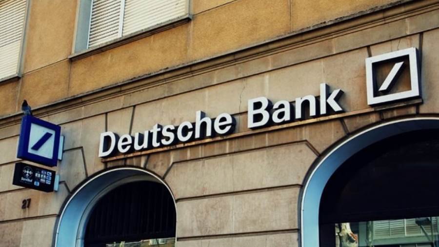
The first Deutsche Bank advertisement to feature the new logo appeared on April 25, 1974. Fifty years later, the logo continues to shape the bank’s global brand presence.

In 1972, Deutsche Bank invited eight internationally renowned graphic design studios to take part in a competition to design a new logo. A total of 140 different designs were submitted and the winning logo was an upward oblique stroke inside a square created by Stuttgart-based artist and graphic designer Anton Stankowski. Employees were asked to give the logo a name, with “signpost” chosen as the best suggestion.
The bank presented the new logo to the public for the first time at its annual media conference on April 2, 1974 and a few weeks later, on April 25, 1974, the logo appeared in an advert in the Frankfurter Allgemeine Zeitung. Playing with the idea of the logo looking a little like a signpost, the advert presented the logo to the world with the statement: This way for modern banking.
Dynamic growth in a stable environment
“Deutsche Bank’s logo stands for dynamic growth within a stable environment – the slash symbolising growth and the square-shaped frame standing for security and stability. The concept behind the logo might be turning 50 but in a complex and volatile global landscape, it is precisely this stability and resilience that our clients are looking for,” says Tim Alexander, Chief Marketing Officer and Chief Experience Officer at Deutsche Bank. “It’s not just our services but also our brand that should convey to our clients across the world the security that we offer them as their Global Hausbank.”
The logo attracts attention with its easily recognisable, enduring and clean design, shaping Deutsche Bank’s identity. The colour blue stands for trust. The angle of the slash is 53 degrees. The tips of the oblique beam are aligned with the inner corners of the square on the top right and bottom left.
Logo creator Anton Stankowski
The logo’s creator, Anton Stankowski, who died in 1998, described Deutsche Bank’s logo as follows: “The visual motif is the polarity between the solid base and a future-oriented dynamism. The staggered diagonal seems to be symmetrical but is in fact asymmetrical. The sloping forward slash is arranged in such a way that it does not divide the square diagonally. That is what is so special about it. The attention value of the graphic arrangement consists in this unexpected visual shift.”
Anton Stankowski created numerous logos during his life and is regarded as a modern pioneer in graphic design. Many of the iconographic symbols he developed have not lost any of their visual power to this day. He not only created memorable images and designs as a commercial artist but also as a photographer, painter, illustrator and graphic artist. He always said art and design were inextricably linked. The Deutsche Bank logo is arguably his best-known logo worldwide.
Deutsche Bank logos prior to 1974
When the bank was founded in 1870, there was no logo at all. Even the company name Deutsche Bank would appear in different fonts within a single document. It wasn’t until the turn of the century that the bank introduced its “imperial eagle” with the initials DB. Strikingly similar to the Prussian and German eagle, people often thought Deutsche Bank was a state institution. In 1937, the bank started using the letters DB as the logo, often in parallel with the eagle.
Largest brand advertisement on the roof of Deutsche Bank Park
Deutsche Bank installed its largest brand advertisement worldwide in 2020 on the roof of the home ground of German Bundesliga club Eintracht Frankfurt, at Deutsche Bank Park. Consisting of the word Deutsche Bank and the logo, the Deutsche Bank Park lettering is 73 metres long and the three-dimensional letters are illuminated with more than 25,000 LEDs. The largest letters are 5 metres high and the logo measures 8.46 metres, which is about the height of a two-storey house.


